

Ever walked into a room and felt instantly at ease, without quite knowing why? Chances are, rhythm had a lot to do with it. It’s one of those design principles that guides your eye from one spot to the next without you noticing the mechanics behind it.
In interior design, rhythm is what stops a space from feeling flat, cluttered, or disjointed. It is the difference between a room that feels “put together” and one that feels like a random collection of nice things. To help you get a better grasp of this concept, we’ll break down what rhythm means and how to weave it into your own spaces, plus why it matters for more than just looks.
What Is Rhythm in Interior Design?
At its core, rhythm is the repetition or variation of elements throughout a space to create a sense of visual flow and movement. A good way to understand rhythm is interior design is its counterpart in music, which has a steady beat, an occasional change of pace, a build-up here and a quieter moment there. Interior design borrows that same idea, just using colour, shape, pattern and texture instead of notes.
Designers typically lean on a handful of techniques to build this flow: straightforward repetition, gradual progression, smooth transitions, deliberate contrast, alternating patterns, and radiating from a central point. You don’t need all six in a single room since trying to cram every technique in usually backfires. Most well-designed rooms lean on just one or two, applied consistently, to feel considered rather than mismatched.
The Role of Colour in Rhythm
The quickest way to build rhythm in a room is through colour, and it comes down to one core focus: repeat it or let it gradually shift so the eye keeps travelling rather than snagging on one spot and stopping.
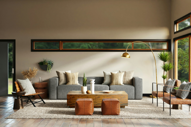
Repetition is the easier option here. If you’ve chosen a soft terracotta as an accent, don’t just use it once—bring it back in a cushion, then a piece of art, then a vase on the other side of the room. That repeated touch is what ties a space together and makes it feel intentional rather than accidental.
If you want a foolproof starting point, the 60-30-10 rule is worth keeping in your back pocket: roughly 60% of the room takes your dominant colour (usually walls and larger furniture), 30% goes to a secondary colour, and the final 10% is reserved for accents. This proportion stops any one colour from overwhelming the space while still giving the eye a consistent thread to follow.
Gradation is a subtler technique worth trying too. Picture a wall that transitions from a deeper shade near the skirting board to a lighter tone near the ceiling, or curtains that shift gradually from a saturated hue to something more muted. Such colour progression pulls the eye along a path, almost inviting it to follow through the room.
Whichever approach you choose, remember colour isn’t just decorative. It can set the emotional tone of a room too, so it’s worth choosing with intention rather than picking whatever’s trending.
Creating Rhythm with Patterns and Textures
Pattern and texture do a similar job to colour, just with a bit more visual texture (pun intended) to play with. The trick is repeating a motif or material at different points around the room, ideally at varying scales so it doesn’t feel like you’ve matched everything from a single collection.
Say you’ve got a striped cushion on the sofa. Echoing that same stripe, perhaps in a smaller, subtler way, on a lampshade or a piece of artwork across the room creates a visual “call and response” that keeps the eye moving. It doesn’t need to be an exact match; a rough visual cousin often works even better, since it feels curated rather than coordinated.
If you’re nervous about mixing patterns, try the rule of three: a solid, neutral base piece, one larger-scale pattern (a bold floral rug, for instance), and a smaller-scale pattern like a fine pinstripe or delicate polka dot. This layering gives you variety without tipping into visual chaos.
Texture works hand in hand with pattern here. Pairing a rough, nubby linen with something smooth and glossy (e.g. a lacquered side table) creates contrast that keeps a room interesting even when the colour palette stays fairly restrained. The interplay between rough and smooth, matte and shiny, is often what makes a neutral room feel rich rather than boring.
How Line and Scale Affect Rhythm
Lines and scale are the subtler cousins of colour and pattern, but they’re arguably just as powerful. Lines dictate the direction your eye travels, while scale determines how “loud” or “quiet” that movement feels.
Vertical lines created by elements such as tall bookshelves, elongated mirrors, or floor-to-ceiling curtains draw the eye upward and can make a room feel taller than it is. Horizontal lines, like a long console table or a row of artwork, tend to widen a space and encourage the eye to travel side to side. Diagonal and curved lines, meanwhile, are brilliant for softening a room and leading the eye in a more relaxed, meandering way, which is why curved sofas and archways so often show up in rooms designed to feel calm.
Scale works alongside this by giving your eye checkpoints to land on. Repeating similar-sized furniture pieces, artwork dimensions, or architectural details throughout a space creates a subtle rhythm of its own, almost like matching beats in a song. That said, this is one area where it’s easy to overdo things. Repeating the same scale everywhere without any variation can flatten a room and make it feel a bit static, so it’s worth throwing in the occasional contrasting size — a statement pendant light above otherwise modest furniture, for example — to keep things lively.
Why Does Rhythm Matter Beyond Aesthetics?
Rhythm isn’t just about making a room look nice in photos. It genuinely affects how a design matches with daily routines by changing how a space functions and how comfortable people feel moving through it.
When rhythm is done well, a room becomes more intuitive to navigate. Repeated visual cues act almost like signposts, subtly telling you where to look and where to walk next, reducing the sense of clutter even in a busy space. This is the same principle behind larger-scale environments like offices and retail stores, where a considered rhythm helps people find their way around without thinking too hard about it.
There’s also a wellbeing angle worth mentioning. Spaces with thoughtfully applied rhythm tend to feel calmer and easier to be in, which isn’t merely a nice-to-have—there’s a growing body of thinking around environmental psychology suggesting that well-organised visual patterns can genuinely support comfort and reduce cognitive strain. In other words, a room with good rhythm doesn’t just look better, it feels easier to exist in.
For anyone designing a home or commercial space, this is worth remembering: rhythm isn’t the finishing touch you add once the “real” design work is done. It’s part of what makes a space actually work for the people using it.
A Few Common Mistakes to Watch Out For
Before we wrap up, here are a few pitfalls worth avoiding as you start experimenting with rhythm:
- Overdoing repetition. Repeating the same colour, pattern or shape too many times without any variation can make a room feel flat or predictable rather than cohesive.
- Adding contrast without an anchor. Contrast is great, but it needs something consistent to play against — otherwise the room can start to feel chaotic.
- Ignoring scale when repeating patterns. A pattern that works beautifully on a large rug might feel overwhelming shrunk down onto a small cushion, or vice versa.
Ready to Bring Rhythm Into Your Space?
Rhythm might be one of the more understated principles of interior design, but it’s often the one doing the most work behind the scenes. Whether it’s a repeated colour, an echoed pattern, a considered line, or a scale that keeps recurring throughout a room, these small, consistent choices are what turn a collection of furniture into a space that actually feels like it flows.
Fortunately, you don’t need to overhaul an entire room to start seeing the benefits. Pick one element and build from there. Pay attention to how your eye moves through the space as you go, and adjust until it feels right rather than forced.
Of course, striking the right balance between repetition and variety takes a practised eye, and that’s exactly where a bit of professional guidance can make all the difference. So, in case you ever want some expert help bringing rhythm (and the rest of your vision) to life in your own home, feel free to reach out at any time and we’ll help you find the flow your space has been missing.
Frequently Asked Questions
1. What is the easiest way to start creating rhythm in a room?
Colour is usually the simplest place to begin. Pick one accent colour and repeat it in at least three spots around the room — a cushion, a piece of art, and an accessory, for example — before layering in pattern or texture.
2. Is rhythm the same thing as repetition in interior design?
Not quite. Repetition is one of the main tools used to create rhythm, but rhythm also includes techniques like gradation, contrast, transition and alternation. Repetition on its own can actually feel monotonous if it isn’t balanced with some variation.
3. Can a room have too much rhythm?
Yes. If every element repeats in exactly the same way with no contrast or variation, a room can start to feel static or overly matched rather than cohesive. A bit of contrast or an unexpected scale change usually keeps things feeling alive.
4. Does rhythm apply to small spaces too, or just large rooms?
Rhythm matters just as much, if not more, in smaller spaces. In a compact room, a well-placed repeated colour or pattern can create a sense of flow that makes the space feel more considered and less cramped.
5. How does rhythm affect how a room actually functions, not just how it looks?
Good rhythm helps guide the eye (and often the feet) through a space, making it easier to navigate intuitively. This is particularly useful in open-plan layouts or larger homes, where a clear visual flow helps different zones feel connected rather than disjointed.
6. Do I need to hire an interior designer to get rhythm right?
Not necessarily — many of these techniques can be applied yourself with a bit of trial and error. That said, professional designers are trained to spot the subtle imbalances that are easy to miss, so working with one can help you achieve a more polished result, especially for larger or more complex spaces.